Well, the day has come. Apple launched a new product category, and I have been wearing my watch for over 24 hours.
I’ll start by saying that I think this is a huge deal. Just getting here is a huge deal. This article is a must read if you want to know why. Every time Apple enters a new product category you can bet than in the next 5 years, they will push forward an incredible wave of innovation and change that will affect all of us in some way. This was true with many of their products in my lifetime. Macintosh, Laser Printers, PowerBook, CD-ROM, AirPort, PowerBook, iPod, iPhone, iPad and now Apple Watch.
I am not going to “rate” the watch in this review. Most of my friends have already started to wonder how long this thing will last on my wrist. I’m also wondering that. I’m optimistic, but I’ll commit to writing a follow-up article in 30-60 days once I’ve had the chance to fully experience it and see if it’s going to last in my life.
Watches
For context. I I have always worn a watch since I was young. Most of my watches were Swatch as a kid, then Casio calculator at some point, then later in life I was fortunate to receive two gifts. A stainless steel Tag Heuer and then for my 30th birthday (and since then) I’ve been wearing a Rolex Air King (34mm case).
I’ve also tried a few wearables. The Original Pebble, Fitbit and Microsoft Band. Each of these has lasted about 1-3 months before i’ve abandoned them. I’ve always enjoyed wearing a stainless steel watch, the quality of the product and the way that’s felt on my wrist, and lets face it. We are early days here for wearables. Comparing an Apple Watch to a Pebble is like comparing a Motorola StarTAC to an iPhone.
Unboxing
My watch was delivered Friday afternoon. My first observation unboxing it was that this was different than other Apple Products. It’s the first Apple product that is jewelry. I ordered the Apple Watch (not Sport) with the classic leather band. The box was heavy and rather large (compared to the Sport box which is more similar to a Swatch box). The box itself is about 2 pounds. It’s the size of a watch box that you’d get buying a high end luxury watch.
First impressions matter. Apple is telling me that this product is first and foremost a luxury product, then a gadget. Apple packaging is always top notch, and this takes it to a new level.
And I can say that I think the watch is rather handsome. I am very happy I went with the “large” watch. It does not feel large at all. Since it’s tall and narrow, it’s approx the same width as may rather small Rolex AirKing and feels no bigger. However, it weighs about half as much as my old watch, which feels rather great.
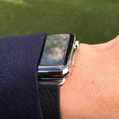
The leather band feels wonderful. I’m used to wearing stainless bands and so this is a nice change. I’m looking forward to trying other bands.
Setup
Compared to other accessories, setup was rather easy. The longest part was loading all the Apps onto my phone. I have many apps on my iPhone (215 Apps) and 62 of them had watch versions (this is where I should mention that my team also built a Watch App!). Lets just acknowledge that this alone is incredible. Apple has such powerful impact in the developer world, and their APIs coupled with their ability to update their whole ecosystem with the latest OSes gives developers a big incentive to support their latest innovation.
That was all the setup really (besides pairing). Apple can obviously do things other cannot or have not figured out how to do, so pairing compared to a Pebble, Fitbit or generic bluetooth device was better.
I’ll admit that I din’t really know how to use this watch, so I watch some of the videos Apple provides in the Watch iOS App.
Experience
I went to an event that evening, so I didn’t have time to do much else and had to experience the watch on the go.
This is a bit of stream of consciousness, but here is what I thought.
Pros
- The Watch experience is great
- Battery life seems better than Apple claims. This is a surprise given battery life estimates usually fall short of daily claims
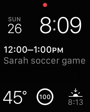
- The watch faces are cool, and I love having weather, calendar and sunrise / sunset always there
- The physical gestures work well. Raise your wrist to see the time or a recent notifications
- The haptic gestures are game changing
- Force Touch is game changing
- The notifications are brilliant, you glance to look and once you’ve seen one they are dismissed on the watch and the phone
- Glances (a special kind of app mode) can be useful
- Paying with Apple Pay is awesome
Cons
- App organization, layout and navigation is really poor. I don't even really understand this at all. My list of apps is a mess, and organizing them is worse than organizing apps on an iPhone which is already atrocious. Apple should spend some R&D here on organizing apps, or borrow from the Microsoft playbook for Windows Phone (the Start Screen and Live Tiles is better than any other phone experience).
- Apps take too long to load
- Glances can get stuck and never load. Glances are not really fast enough
- Apps are a bit immature
- Force touch isn’t well implemented
- The heartbeat and drawing features you can send others are cute, but not game changing. It’s sort of neat to know who has an Apple Watch and who doesn’t, but this isn’t a “blue vs green bubbles” feature yet.
Powerful Scenarios
There are however, some very powerful wrist scenarios. One of the applications I use, Workflow, lets you basically build smart actions that stitch together features and functions across apps. This is very “geeky” but also demonstrates that these little phones and watches we have are infinitely flexible, just like computers.
I built a Workflow that I can use to get driving or walking directions to my next appointment.
1. Select “Directions to Next Appt - looks up calendar for next appointment
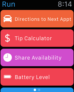
2. Asks which Appointment I want directions for
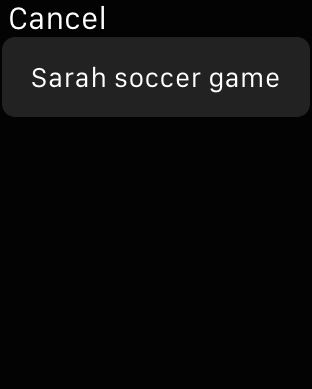
3. Tells me approx how long it will take
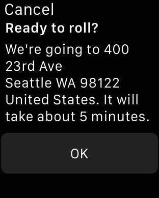
4. Launches the Maps app allowing me to chose Drive or Walk
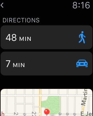
5. Kicks off Navigation and Handoff to my phone allowing me to use either Watch or Phone (or both) for Navigation. Note the watch does turn by turn directions using visual and haptic gestures. 2 taps to go right and 3 to go left. I’ll get to haptic later, but this is the future of notifications.
Game Changing Capabilities
The two biggest game changing capabilities that I see are Haptic Notifications and Physical Gestures.
Haptic Notifications
you may never have heard this word haptic before. Many of you have vibration mode on your phones. Haptics take that further by applying different vibration levels and durations to communicate something.
Apple calls this the Taptic Engine.
It’s called the Taptic Engine, a linear actuator inside Apple Watch that produces haptic feedback. In less technical terms, it taps you on the wrist whenever you receive an alert or notification, or press down on the display. Combined with subtle audio cues from the specially engineered speaker driver, the Taptic Engine creates a discreet, sophisticated, and nuanced experience by engaging more of your senses. It also enables some entirely new, intimate ways for you to communicate with other Apple Watch wearers. You can get someone’s attention with a gentle tap. Or even send something as personal as your heartbeat.
And to me this is the piece of technology which will transform how we interact with technology and objects. The watch is just the first mainstream, quality, powerful experience that uses this. Gamers on Xbox have probably experienced this before via the controller, but hey, we are not all gamers.
Physical Gestures
The Watch is the first product that I’ve used that is capable of doing this well. It seems to know when my eyes are locked on my wrist. Incredible. If I get a phone call I can cover my watch to silence it. If I press and hold on various screens different actions happen. Apple calls this Force Touch
In addition to recognizing touch, Apple Watch senses force, adding a new dimension to the user interface. Force Touch uses tiny electrodes around the flexible Retina display to distinguish between a light tap and a deep press, and trigger instant access to a range of contextually specific controls. With Force Touch, pressing firmly on the screen brings up additional controls in apps like Messages, Music, and Calendar. It also lets you select different watch faces, pause or end a workout, search an address in Maps, and more. Force Touch is the most significant new sensing capability since Multi‑Touch.
We may forget this, but Apple is the company that really made capacitive touch mainstream. Capacitive touch is essentially the screen on your iPhone or iPad. A piece of glass that works against your finger and does not require pressure or stylus. Many touch phones at the time did not employ Capacitive touch.
The Watch is employing two very novel ways of augmenting these existing forms of interaction such as Voice, Touch and physical dials.
When you think about it, the Watch employs a ton of input and feedback mechanisms. More than any device you have today. And it’s all packed into such a tiny package. Incredible.
Apps
Ok, so lets talk about apps. This is probably the most underwhelming part of the Watch right now. But since Apple has created a platform that is married to the most sophisticated gestures and feedback, you can expect a lot of innovation.
The basic built in apps are great and provide decent enough experiences to call it a day.
My favorite apps are:
Siri - not really an app, but if you know how powerful Siri is, well, you have a virtual assistant on your wrist. “Where is my wife” is a command Siri can respond to me with, and provide the exact details of my Wife’s location. Same for “Notify me when Lora leaves work”.
Notifications - not really an app either, but with the 200+ apps I have they are pretty chatty and noisy. Being able to quickly glance to see if I should bother looking at my phone is nice. Also nicer is when I get a phone call or text from my wife I can know that right away.
Messaging - coupled with Siri I can reply to most messages as well as author. Messaging is the #1 app I use on my iPhone. I suspect it will be the #1 app I end up using on my Watch.
Calendar - I go from meeting to meeting and having this on my wrist is killer
Passbook - I love Passbook. Every time I fly it’s the most convenient way to get through security and board the plane. It’s a bit cumbersome to manage a phone and luggage and 2 kids, so I expect this will simplify this among other things like paying at Starbucks (till they offer Apple Pay).
Handoff - not really an app, but a capability of Apple’s devices. The nice thing here is that Apple knows which device is “active”, In other words, if I am using my phone, notifications arrive there and aren’t duplicated on my watch (or Mac). Similarly if my watch is active, it is the primary notification endpoint. If I am using a Mac, Watch and iPhone Apple introduces a small delay to give me time to act on a notification before it’s broadcast to the other devices. I’m not sure anyone has noticed or written about this subtle behavior. Why would you? It’s intelligent and something that’s incredibly hard to do technically. Believe me you’d notice if this tech did not exist. In a world where I get calendar notifications on my wrist, I should not need to see duplicate reminders any where else. Today I get 1x notification per PC or device.
In terms of currently useful 3rd party apps, there are a few cool ones that I’ve made into Glances (you have a limit of 20 glances).
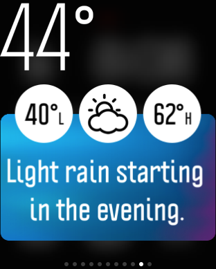
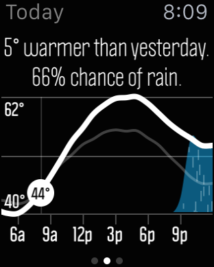
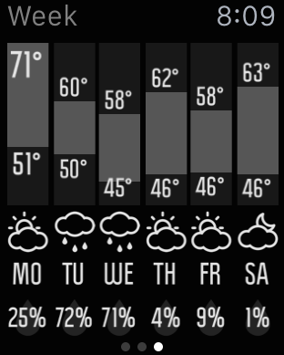
Weather Nerd - [$3.99 iTunes] one of the great thing about Apple product launches are some of the new apps you’ll discover. Apple has a great habit of show-casing and promoting apps that take advantage of their latest products, and this is no exception. I was looking for a weather app that was better than the stock Apple one and ran across this app. Brilliant. This is the best app on Apple Watch.
Here is their glance:
And their app:
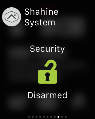
 Some other Glances I like are the New York Times and my Alarm company’s app, Alarm.com


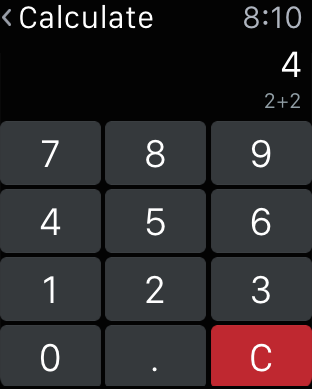
Finally, this brings back some memories (Calcbot)

Oh, and of course the Watch App. After all, this thing is a Watch.

In closing… I am very excited about this category for Apple. They have delivered something that exceeds what I would expect of a v1 product. You can bet that the next few years will change a lot about how we experience technology in our lives.
Time will tell if this is a lasting v1 product experience. I’m optimistic.




 Some other Glances I like are the New York Times and my Alarm company’s app, Alarm.com
